Introduction
A fintech website is judged almost immediately on whether the company looks legitimate. That verdict comes from clarity, visible pricing and credible proof, not from the design being adventurous. Clever is a liability in this sector.
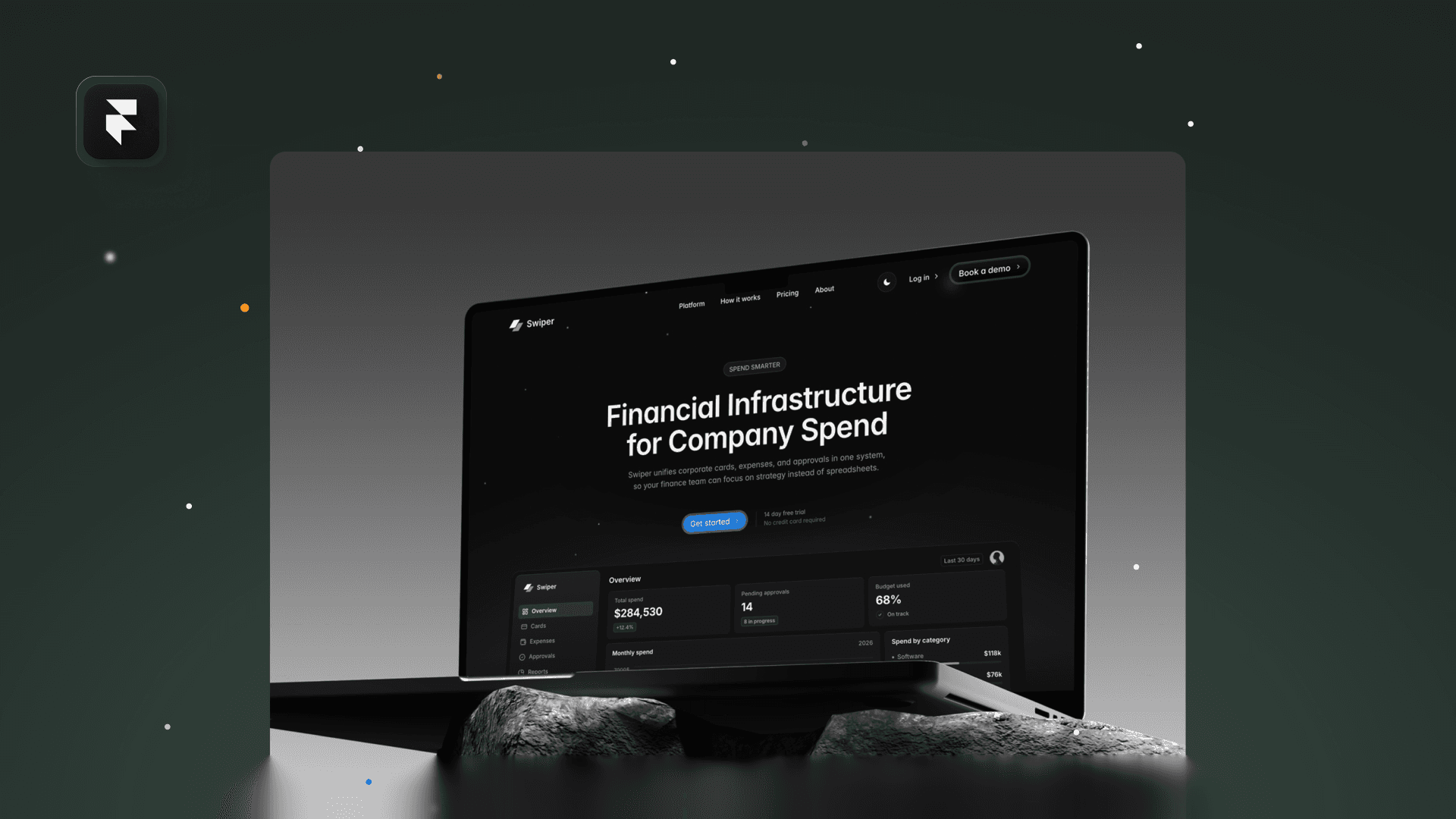
That is the thinking behind Swiper, our free Framer fintech template.

Say What It Does, Immediately
The single most common fintech homepage failure is a headline that describes a category rather than a product. Financial infrastructure for modern teams tells a visitor nothing. Name the thing it actually does, in the words a customer would use.
Trust Signals Belong Above the Fold
Regulatory status, who holds the funds, and which recognisable companies already use it. These are the questions a serious visitor has in the first screen, and answering them late means answering them to nobody.

Builds confidence | Erodes it |
|---|---|
Plain description of what the product does | Category language and abstractions |
Pricing page you can reach in one click | Contact sales as the only option |
Named customers and real numbers | Anonymous logos and unattributed quotes |
Regulatory and custody details stated | Security page with no specifics |
Pricing You Can Actually Find
Hiding pricing behind contact sales is defensible for enterprise and damaging for everything else. If a visitor cannot work out roughly what it costs, they compare you against a competitor who told them, and that comparison happens without you.
Proof Beats Adjectives
Secure, fast and reliable are claims every competitor also makes, so they carry no weight. Uptime figures, named customers, settlement times and audit results are checkable, and checkable is what persuade a cautious buyer.
Before You Ship
Show the homepage to somebody outside the company for ten seconds, then ask what the product does. If they cannot answer, no amount of design work below the fold will save the page.
Swiper is free to remix, alongside the rest of our free Framer templates.