COMPONENT

Light & Dark Theme Toggle for Framer

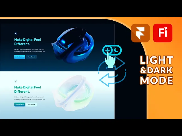
A free light and dark theme toggle for Framer that remembers what visitors pick, plus a code override for the components that colour styles cannot reach.

Added on

Light & Dark Theme Toggle for Framer
Contents
No headings found

Introduction

A complete light and dark theme switch for Framer. Drop it into your project, in the header, the footer or both, and visitors can move between themes with one click. Their choice is remembered, so returning visitors land in the theme they picked instead of being reset to your default every time.

It ships with a code override as an extra, for the components that color styles cannot reach. More on that below.

Grab it for free or pay what you want, including nothing at all.

Why Framer Needs This

Framer already handles light and dark properly at the color level. Every color style carries a light value and a dark value, so fills, text and borders switch on their own and you never design anything twice. Once the toggle is in place, most of your site follows immediately with no further setup.

Getting Started

Drop the toggle wherever you want it and it works. There is nothing to wire up, because it reads and writes the site theme directly.

The setup happens in Framer's own color styles, not in this component. Open the Assets panel, go to Styles, and create a color style for each color your site uses. Every style holds two values, one for light and one for dark.

So a style named Background might be white in light mode and near black in dark mode. Apply that style to your sections instead of picking a raw hex value, and the toggle handles both states from then on. You are never designing the same page twice.

This is also the usual reason a site only half changes theme: anything still set as a fixed hex on an individual layer has no second value to switch to, so it stays exactly as it is while everything around it moves.

Component Features

Default

Sets which theme a first time visitor sees. Choose Light, Dark, or System. System follows whatever the visitor has set on their device, so someone browsing at night in dark mode lands in dark mode without touching anything. Once they use the toggle their choice takes over.

Size

Adjusts the icon size, with a default of 16px. Increase it if the toggle is sitting on its own in a footer, decrease it when it sits inline with navigation links.

Icons

Controls how the toggle looks in each theme. You set the icon color for light mode and for dark mode separately, and you can paste your own SVG for either one. Because the two SVG slots are independent, you can use genuinely different shapes rather than the same icon recolored, which is what most theme switches do.

The Extra: A Code Override for Components

Color styles cover most of a site, but they stop at components. Anything whose appearance lives in a variant rather than a color style will not follow the theme, so a dashboard mockup or a button with its own visual states stays stuck in whichever theme you built it in.

The included override fixes that. Name your variants in pairs and apply the override to the instance:

  • Desktop [Dark] and Desktop [Light] on a dashboard or product mockup.

  • Neutral [Dark], Neutral [Light], Blue [Dark] and Blue [Light] on a button with more than one style.

There is nothing to configure. If none of your components use variants, you can ignore this part entirely and just use the toggle.

The Naming Contract

If you do use the override, this is the part worth reading twice. The swap works by matching the text in the variant name, not by any setting you fill in. That has two consequences:

  • Keep the [Dark] and [Light] suffix exactly as it is. Renaming a variant to something else breaks the switch for that instance, silently.

  • Always add new variants as a pair. A variant with no counterpart has nothing to swap to, so it will sit in one theme while everything around it changes.

Before You Publish

Check both themes. The fastest way is to toggle the theme in the preview and scroll through every page, watching for anything that stays the wrong color. Variant driven components are where problems hide, since color styles rarely get it wrong.

Shipping a Single Theme Site

If you decide you only want one theme, remove the toggle and the site stays in whichever theme is set as the default. You can leave the color styles and the paired variants in place. The unused values do no harm, and it means you can add the toggle back later without rebuilding anything.

Do I need this if Framer already supports colour styles?
icon

Colour styles hold the light and dark values, but something still has to switch between them, which is what the toggle does. The included override then covers components whose appearance lives in a variant rather than a colour style.

How does the override know which variant to switch to?
icon

It matches the text in the variant name. A variant ending in [Dark] is paired with the one ending in [Light], so the swap happens by naming rather than by anything you configure.

What happens if I rename a variant?
icon

The swap breaks for that instance, and it breaks quietly. Keep the [Dark] and [Light] suffix exactly as it is, and add any new variants as a pair so both themes have something to match.

Does it remember which theme a visitor picked?
icon

Yes. Someone who switches to light mode lands in light mode next time they visit, rather than being reset to your default on every session.

Can I put the toggle in more than one place?
icon

Yes. Two instances on the same page stay in sync, so a toggle in the header and one in the footer always show the same state. Switching either one updates both, along with the rest of the site.

Get a free

domain with Framer

Meet your new social media planner.

New Framer Template just Dropped

swiper fintech framer template

Recommended articles

Loved this? Keep exploring with our handpicked Framer resources, dive deeper, sharpen your skills and level up your Framer game.

Top 15 Must-Have Framer Plugins for 2026

15 Must-Have Framer Plugins for 2025

Framer vs Figma Sites in 2026: Which Should You Actually Build On?

Framer vs Figma Sites in 2026: Which Should You Actually Build On?

The 15 Best Free Framer Fonts in 2026

Top 15 Free Framer Fonts to Improve Your Designs in 2025

Shuffle Cloned Instances Component for Framer

shuffle cloned instances component for Framer

Table of Contents Component for Framer

table of contents component for Framer

Framer vs Webflow: Which Platform is Best for Web Design in 2026?

Framer vs. Webflow: Which Platform is Best for Your Web Design Needs?

Pixelated Preloader for Framer

pixelated preloader component for framer by pixcodrops.com

Autoplaying Carousel Component for Framer

preview of an autoplaying vertical carousel with background change for framer

Scroll Spin Gallery Component for Framer

scroll spin gallery component for framer by pixcodrops.com

Timed Popup Ad Component for Framer

Timed Popup Ad Component for Framer

Top 10 Free Framer Fonts Every Designer Must Use in 2025

Top 10 Free Framer Fonts Every Designer Must Use in 2025

Step-by-Step: Using Framer’s Workshop AI for Components

Step-by-Step: Using Framer’s Workshop AI for Components

How to Add a Lightbox Gallery to an Image from a Framer CMS Gallery

How to Add a Lightbox Gallery to an Image from a Framer CMS Gallery

Before and After Slider Component for Framer

Before and After Slider Component for Framer

Typewriter with Blur Component for Framer

Typewriter with Blur Component for Framer

Top 15 Must-Have Framer Plugins for 2026

15 Must-Have Framer Plugins for 2025

Framer vs Figma Sites in 2026: Which Should You Actually Build On?

Framer vs Figma Sites in 2026: Which Should You Actually Build On?

The 15 Best Free Framer Fonts in 2026

Top 15 Free Framer Fonts to Improve Your Designs in 2025

Shuffle Cloned Instances Component for Framer

shuffle cloned instances component for Framer

Table of Contents Component for Framer

table of contents component for Framer

Framer vs Webflow: Which Platform is Best for Web Design in 2026?

Framer vs. Webflow: Which Platform is Best for Your Web Design Needs?

Pixelated Preloader for Framer

pixelated preloader component for framer by pixcodrops.com

Autoplaying Carousel Component for Framer

preview of an autoplaying vertical carousel with background change for framer

Scroll Spin Gallery Component for Framer

scroll spin gallery component for framer by pixcodrops.com

Timed Popup Ad Component for Framer

Timed Popup Ad Component for Framer

Top 10 Free Framer Fonts Every Designer Must Use in 2025

Top 10 Free Framer Fonts Every Designer Must Use in 2025

Step-by-Step: Using Framer’s Workshop AI for Components

Step-by-Step: Using Framer’s Workshop AI for Components

How to Add a Lightbox Gallery to an Image from a Framer CMS Gallery

How to Add a Lightbox Gallery to an Image from a Framer CMS Gallery

Before and After Slider Component for Framer

Before and After Slider Component for Framer

Typewriter with Blur Component for Framer

Typewriter with Blur Component for Framer

Top 15 Must-Have Framer Plugins for 2026

15 Must-Have Framer Plugins for 2025

Framer vs Figma Sites in 2026: Which Should You Actually Build On?

Framer vs Figma Sites in 2026: Which Should You Actually Build On?

The 15 Best Free Framer Fonts in 2026

Top 15 Free Framer Fonts to Improve Your Designs in 2025

Shuffle Cloned Instances Component for Framer

shuffle cloned instances component for Framer

Table of Contents Component for Framer

table of contents component for Framer

Framer vs Webflow: Which Platform is Best for Web Design in 2026?

Framer vs. Webflow: Which Platform is Best for Your Web Design Needs?

Pixelated Preloader for Framer

pixelated preloader component for framer by pixcodrops.com

Autoplaying Carousel Component for Framer

preview of an autoplaying vertical carousel with background change for framer

Scroll Spin Gallery Component for Framer

scroll spin gallery component for framer by pixcodrops.com

Timed Popup Ad Component for Framer

Timed Popup Ad Component for Framer

Top 10 Free Framer Fonts Every Designer Must Use in 2025

Top 10 Free Framer Fonts Every Designer Must Use in 2025

Step-by-Step: Using Framer’s Workshop AI for Components

Step-by-Step: Using Framer’s Workshop AI for Components

How to Add a Lightbox Gallery to an Image from a Framer CMS Gallery

How to Add a Lightbox Gallery to an Image from a Framer CMS Gallery

Before and After Slider Component for Framer

Before and After Slider Component for Framer

Typewriter with Blur Component for Framer

Typewriter with Blur Component for Framer

FRAMER DISCOUNT

Host your website on Framer

Enjoy 3 months free on your Pro Annual Subscription when you sign up on Framer. Simply enter the code partner25proyearly at checkout.

FRAMER DISCOUNT

Host your website on Framer

Enjoy 3 months free on your Pro Annual Subscription when you sign up on Framer. Simply enter the code partner25proyearly at checkout.

FRAMER DISCOUNT

Host your website on Framer

Enjoy 3 months free on your Pro Annual Subscription when you sign up on Framer. Simply enter the code partner25proyearly at checkout.

framer resources by pixco

FREEBIES

Framer snacks
on the house

Snag slick components and magic-level code overrides for your next project. Totally free because you're awesome like that.

framer resources by pixco

FRAMER RESOURCES

Framer snacks
on the house

Snag slick components and magic-level code overrides for your next project. Totally free because you're awesome like that.

framer resources by pixco

FRAMER RESOURCES

Framer snacks on the house

Snag slick components and magic-level code overrides for your next project. Totally free because you're awesome like that.