Introduction
This Table of Contents component for Framer is built to make long-form pages easier to navigate without relying on a full-page document scan.
Unlike conventional table of contents components, this version can target a specific container ID instead of scanning and displaying the entire page. That makes it especially useful for layouts built with Framer Scroll Sections, where the content area is intentionally scoped and the navigation should follow that structure.
It is designed for full visual flexibility, allowing you to style the content list to match your site with custom typography, colors, hover states, spacing, and indicator styles. Whether you want a subtle editorial look or a more interactive navigation pattern, the component gives you precise control while keeping the reading experience clean and organized.
Getting Started
Click on the remix link you received from Polar which will open the project in Framer. Grab the component from the canvas by copying and pasting it into your own project.
Component Features
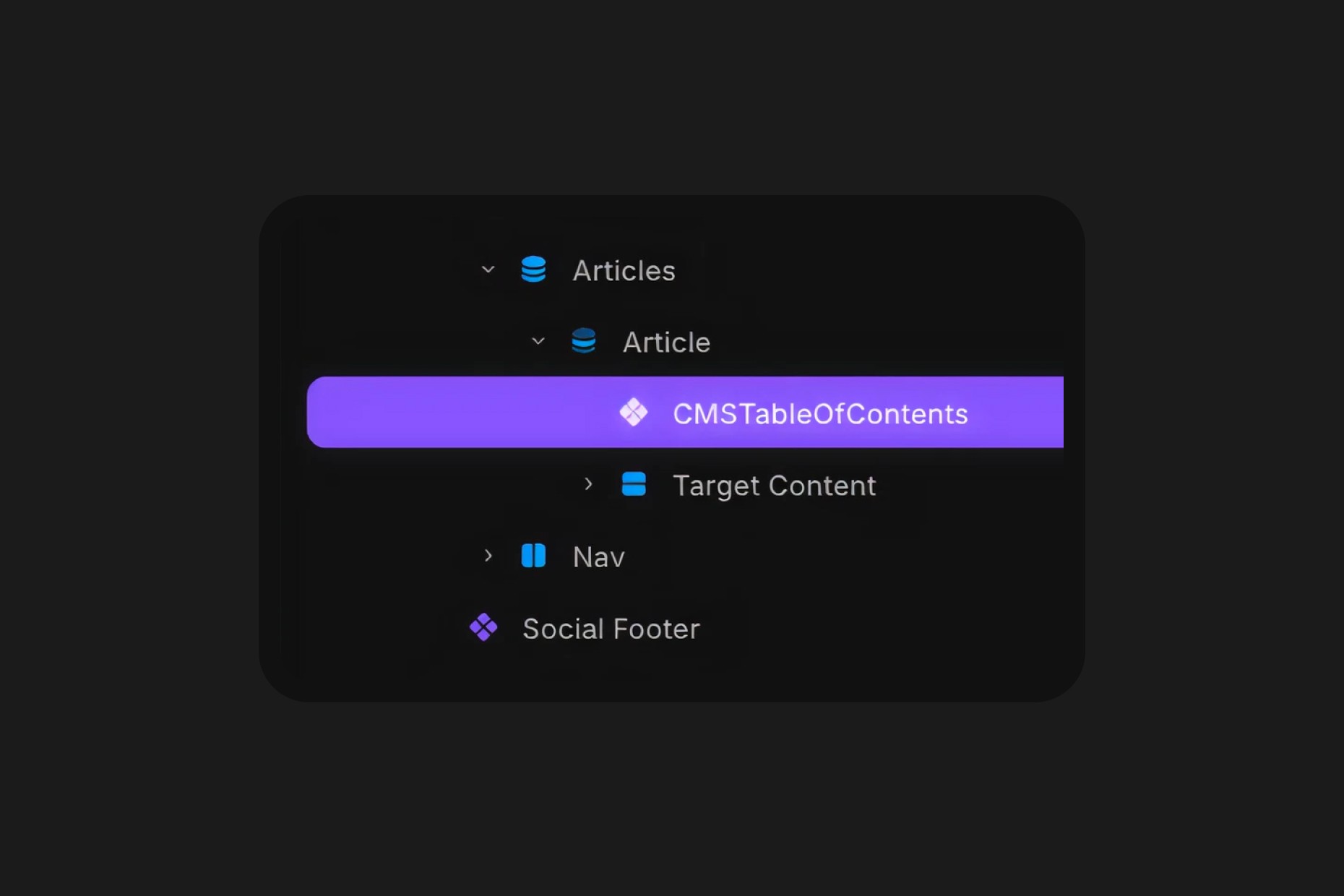
Container ID
Set the container ID you want the component to scan instead of reading the entire page.
This is what makes the component different from a more conventional table of contents. It can target the exact content area used by Framer Scroll Section IDs, and you can even define multiple targets by separating them with commas.
Note that on the Framer canvas you won't see the targeted titles, instead you will see it in Live Preview or Published.
Label
Customize the label shown at the top of the table of contents.
You can use it as a section title such as “Contents”, rename it to better match your brand, or hide it depending on the style of your page.
Divider
Control the appearance of the divider that separates the label from the navigation items.
This helps create clearer visual structure and gives you another styling layer to match the component to the rest of your article design.
Content
Choose how the content items are displayed and styled.
The component can target heading levels such as h2, h3, and h4, while leaving h1 untouched for the page title. This gives you a more editorial hierarchy and avoids conflicts with the main article heading.
Indicator
Select the indicator style shown next to each item.
You can choose between a vertical bar, a bullet, an arrow, or hide the indicator entirely for a more minimal presentation.
Font
Fully customize the text styling to fit your brand.
You can adjust fonts, sizes, weights, colors, and spacing so the table of contents feels like a native part of the page rather than an added utility block.
Hover Effects
Style the hover and active states to create a more polished interaction.
This allows the component to feel subtle and refined or more expressive, depending on how much emphasis you want the navigation to have.
Padding
Control the padding for each element with simple T R B L controls or set one value for all.
Transition
Control how the component responds visually during interaction.
This helps smooth out state changes and gives the navigation a more premium feel when readers move through the article.