SUPPORT PAGE
Nordhjem Documentation
Crafted for vacation rentals, boutique hotels, and unique getaways that want to capture attention and inspire bookings.
Introduction
Thank you for using the Nordhjem template by Pixco! Below, we'll guide you through the template’s features and settings, so you can customize it to perfectly suit your needs.
Don’t have the template yet? Get it here.
Customizing the Header
The Header is a crucial part of your site’s navigation, allowing you to incorporate branding and provide easy access to booking options.
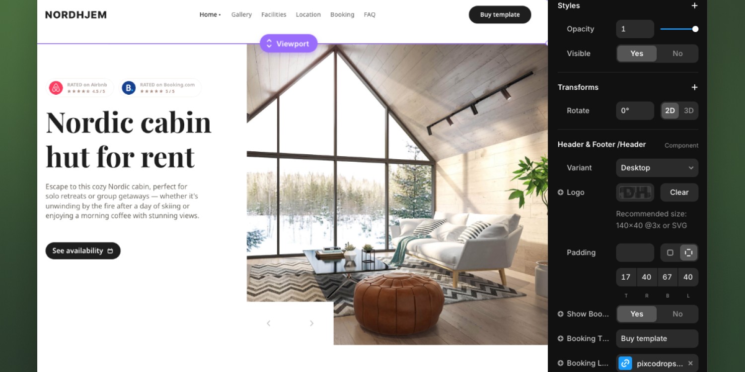
Logo: Upload your own logo to replace the default. Supported formats are SVG or PNG. The recommended size is 140x40px at 3x resolution. Ensure the resolution is appropriate to avoid scaling issues or pixelation. To replace the logo, click the Clear button next to the placeholder and select your logo file.
Booking Button: Customize the booking button by editing both the text and the URL link. You can modify the button text to reflect your chosen booking platform, such as "Book via Airbnb" or "Reserve Now". Then, replace the URL under Button Link with the direct link to your listing on that platform. This ensures seamless booking for users.
Padding: It is recommended to keep the default padding values (top: 17px, bottom: 40px, left: 47px, right: 67px). Adjusting these might disrupt the overall layout and alignment of the elements (logo, navigation, and button). Maintaining these values ensures a balanced and visually appealing header across devices.
Hero Carousel
The CarouselSlide component allows you to display multiple images in a responsive slideshow format.
Number of Images: You can include up to 6 images in the carousel. To add an image, click on the respective image slot and upload your desired image. Ensure images are high quality and properly sized for the best display.
Previous & Next Arrows: Customize the navigation arrows by uploading your own icons or using the default ones. To replace the arrows, click on the arrow placeholder and select your custom icon.
Arrow Size: Use the Arrow Size slider to adjust the size of the navigation arrows. This allows you to make them more prominent or more subtle, depending on your design preferences.
Autoplay: Toggle between enabling or disabling the autoplay feature. Selecting "Yes" enables the carousel to cycle through images automatically, while selecting "No" requires users to manually navigate through the images.
Autoplay Speed: When autoplay is enabled, you can set the speed at which the images rotate. The default is 2.5 seconds, but you can adjust this to suit your needs.

Gallery with Lightbox
The Lightbox feature provides a fullscreen view of your images, enhancing the user experience by allowing them to view your property’s images in greater detail. Here’s how to work with the Lightbox and its settings:
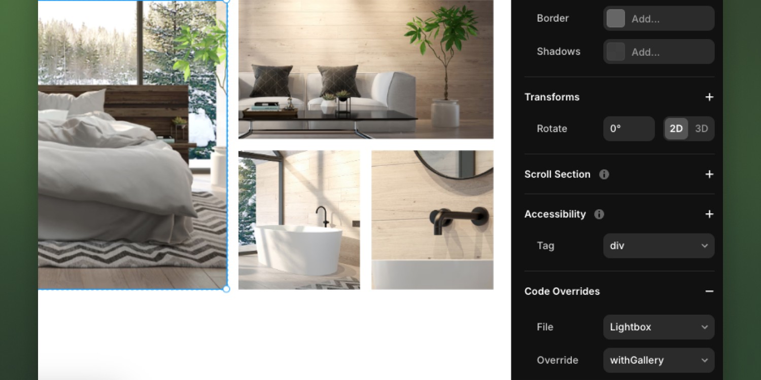
Single Image or Gallery:
You have the option to choose between displaying a single image or a gallery of images within the Lightbox. In the Code Overrides panel, set the Override to either single or withGallery depending on whether you want to display one image or multiple.Replacing Images:
To replace images in the gallery, simply drag and drop new images into the image slots. This allows for quick updates to the gallery content without needing to change any other settings.Duplicating Galleries:
If you want to display more images, go to the Layers Panel and duplicate the existing gallery. There’s already one duplicated gallery with its visibility set to hidden. You can make this gallery visible to immediately add more images to the page.
Facilities
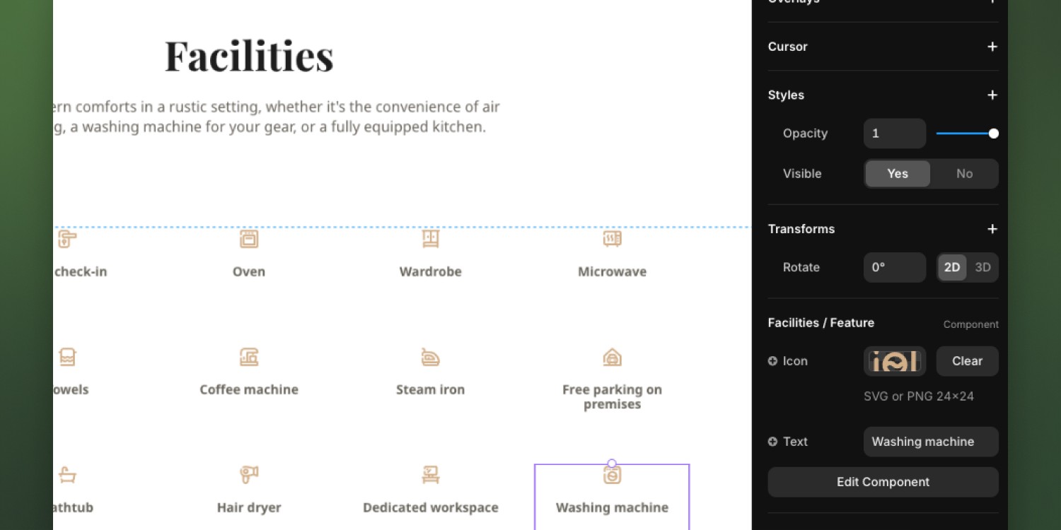
The Facilities component allows you to showcase the amenities available in your property. Here’s how you can manage and customize this section:
Default Facilities: Several default amenities such as WiFi, air conditioning, and free parking are already included. Each facility is paired with an icon and a label.
Adding More Facilities: To add additional facilities, duplicate an existing one. After duplicating, you can replace both the icon and the text. Upload an icon in SVG or PNG format (24x24px) and change the text to reflect the new facility, such as "Washing Machine" or "Coffee Machine".
Property Location
The Map component helps display the exact location of your property using a Google Map integration. Here’s how to customize it:
Location: Enter the latitude and longitude coordinates of your property to accurately place it on the map, you can get these from Google Maps. This ensures potential guests can easily find where the property is located.
Custom Marker: You can replace the default map marker with a custom icon by uploading an image that represents your property or brand.
Street View: Toggle the option to Show or Hide Street View, allowing users to explore the surroundings of your property in more detail.
Map/Satellite View: Choose whether to display the map in standard map view or satellite view. Select Show for the satellite option to give a more detailed, aerial view.
Fullscreen Mode: Enable the Fullscreen option to allow users to view the map in full screen, making navigation easier.
Zoom Level: Adjust the zoom level of the map using the slider. A higher number zooms in closer to the property, while a lower number provides a more zoomed-out view.
Disable Pan: You can disable the ability for users to pan around the map by setting Disable Pan to Yes. This will lock the map in place, focusing only on your property’s location.

Booking Platforms
The Booking Platforms component allows you to showcase multiple booking platforms for your property. This gives users the flexibility to book from their preferred service.
Multiple Platforms: You can add as many booking platforms as you like. Several platforms such as Airbnb, Booking.com, and others are already pre-configured. To add more, simply duplicate an existing platform.
Image Customization: Upload the logo or image of the booking platform by clicking on the Image placeholder. Ensure the image accurately represents the platform for better user recognition.
Description: Edit the Description to provide details or marketing text for the platform. This helps guide the user to make a booking by emphasizing the benefits of each platform.
Button Text: Customize the Button Text to match the platform, such as "Book via Airbnb" or "Reserve on Booking.com". This allows clear communication for each option.
Button Link: Replace the Button Link with the URL to your property listing on the respective platform. This ensures that users are directed to the correct page for booking.

Frequently Asked Questions Section
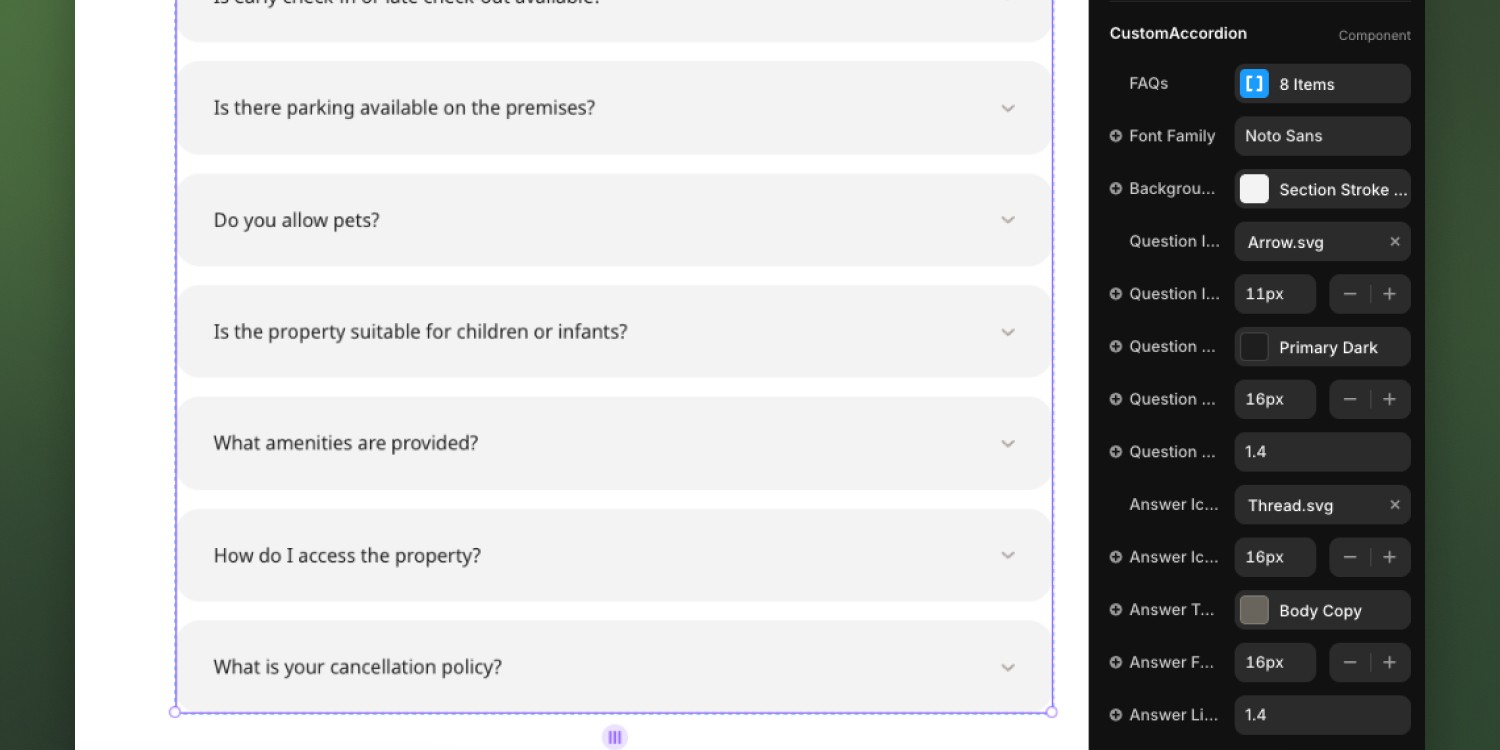
The FAQ Accordion section is perfect for addressing common questions about your property. It provides an organized way for users to find quick answers.
Number of Questions: You can add as many questions as you'd like. There are no limits on the number of questions you can include in the accordion, so feel free to add as many as necessary to cover all user inquiries.
Customization: While it's possible to adjust various settings (such as font size, icons, and colors), it is recommended to leave the default settings as they are to maintain the overall design consistency. This ensures the accordion looks clean and functions properly across different devices.
Footer
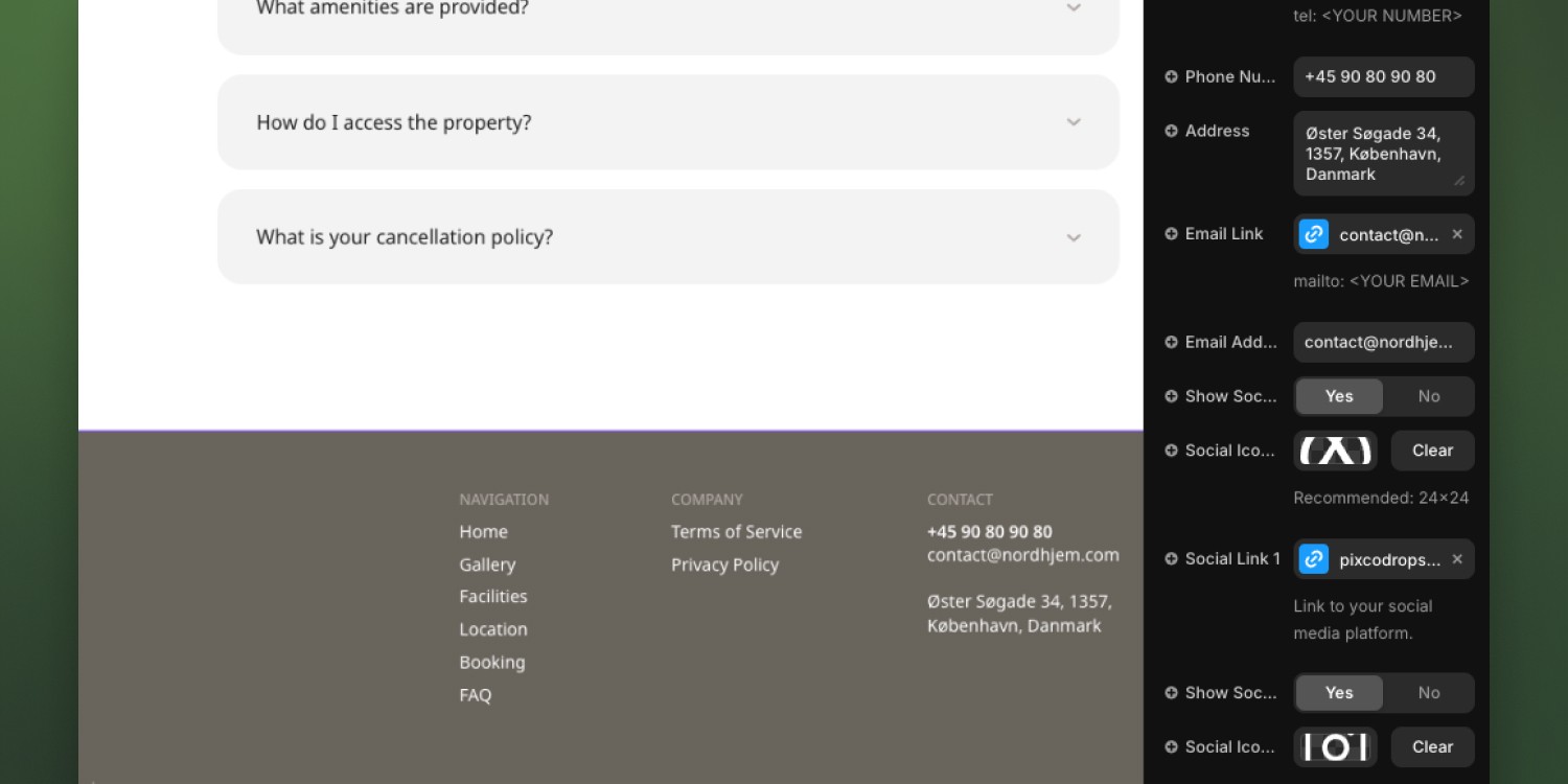
The Footer component provides essential contact information and social media links for your property. Here’s how to customize it:
Social Media Links: There are four predefined social media links included in the footer. If you need a fifth link, simply add another one. You can replace the social icons to match the platforms you're using (e.g., Facebook, Twitter, Instagram).
Replacing Social Icons: Each social link includes an icon. To change it, click on the Social Icon placeholder and upload a new icon (recommended size: 24x24px). Ensure the icon clearly represents the platform to make it easy for users to recognize.
Contact Information: Customize the contact details, including your phone number, email, and physical address. These can be edited directly in their respective fields.
