Introduction
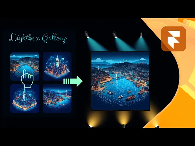
Create polished image galleries or standalone lightbox experiences with seamless animations, gestures, and mobile-friendly behavior. This code override let you add professional lightbox functionality to any image in your Framer project while preserving aspect ratios, enabling swipe navigation for galleries, zoom in/out, and offering intuitive drag-to-close interactions (on mobile).
Why Add a Lightbox?
Lightboxes elevate user experience by focusing attention on media without disrupting the layout. With these overrides, you can:
Showcase images in full-screen clarity without compromising page structure.
Enable gesture controls (swipe for galleries, drag-to-close on mobile).
Maintain design consistency with customizable arrows, overlays, and animations.
Simplify CMS integration as it works dynamically with Framer CMS images and galleries.
Whether building a portfolio, product grid, or blog, these overrides solve the problem of cluttered layouts while adding a layer of interactivity.
If you're looking into using just one image in your project tied to a Framer CMS gallery that opens up a lightbox and shows multiple images, you might be interested in another tutorial with component provided to isolate a specific image from a CMS gallery here.
Lightbox Features
Desktop
On desktop, you can use the left and right arrow keys to navigate between the gallery together with the previous and next buttons. Clicking on the close button or outside the image will close the gallery, as well as using the escape key.
Images using the gallery override on the same page will all be accessible once one of them is open. The lightbox doesn't show the navigation arrows if there is only one single image that has the override.
Hovering over an image that has the framer lightbox code override will create an overlay with a magnifying glass button.
Dragging the image on desktop serves only to make it seem more interactive.
Mobile
On mobile, the lightbox will auto-detect the device and add the swipe gesture functionality which allows for easier navigation. Dragging the image up on mobile will also add a new way to close the lightbox. The swipe up functionality is commonly used on iOS devices to close apps, it served as an inspiration.
Core Functionalities
The lightbox is fully responsive, adapting seamlessly to screen sizes with real-time resizing. It features subtle, performance-optimized animations (like image scaling) and hover effects for buttons. Customizable variables at the top of the code make it easy to tailor, while its simple integration ensures no layout changes are needed in existing Framer projects.
Zoom Effect
As of July, 2025, you can choose to enable the zoom functionality (on by default) which gives users the possibility to zoom in/out on images while the lightbox is open.
The zoom in factor enables panning to accommodate all image ratios, whether it's a 16x9, 9x16, or else. Once the zoom scale has been set back to the initial size or the minimize button has been pressed, the image will re-render to it's default position and size.
Video tutorial by Akin Gundogan, make sure to check out his Youtube channel!
Optimized for Performance
The lightbox is optimized for peformance and search engines, with subtle animations, lazy-loading for faster initial loads, and gesture prioritization to ensure smooth interactions on all devices.

How to Use the Code Override
The code override is simple to use and takes just a few steps to integrate into your Framer project:
Grab the remix link at the bottom
In the assets panel locate the LightboxGallery.tsx
If you want, you can edit constants at the top (e.g.,
arrowSizeDesktop,lightboxBackground) to match your design⌘ + Ato select all and⌘ + Cto copy allIn your Framer project, create a new Code Override and paste the code inside
Select any image layer you want to add gallery functionality to
In the code overrides panel you will set the File to whatever you called your code override and the Override to
withGalleryDone, you're all set
P.S. You will only see the code override in action once you press Preview or Live within a browser.
P.P.S. You can have multiple different image galleries on the same page by duplicating the code override and giving it a different unique name.