Introduction
This component is a Framer resource designed to facilitate country selection and/or, phone number input. Whether you're building user registration forms, contact pages, or international interfaces for personal projects, framer templates or client projects, this component integrates seamlessly with your forms. It offers two variants: Phone for a combined country selector and phone number field, or Locale for standalone country selection, with extensive customization options to align with your needs.
Component Features
There are multiple smart features about this component that benefit UX for the user and help facilitate conversions.
The best part about this component is that there is no masking, or fake elements that you place on top of a native Framer form field. You just drop the component in your current Framer form and it connects automatically to the form acting just like any other input field.
The dropdown has a search field that makes it very easy to find the country you are looking for if scrolling is not desired. If no results are found due to misspelling the search field will just show a "No matches found".
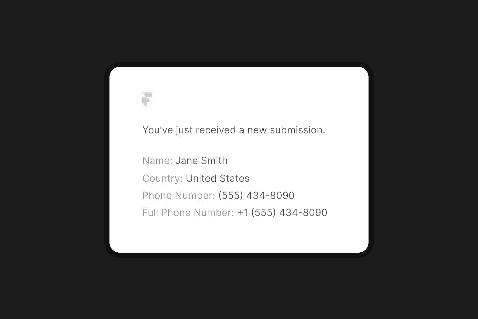
Once the form is submitted, the data you receive from the component input fields are exactly like the native Framer ones, with one addition, the phone number is separated into two fields, one is the phone number and the other is the full phone number (with country code).
The Phone variant contains auto-formatting for phone numbers which help facilitate readability and make it seem professional and polished. If a phone number has been introduced and the country is changed, the phone number will automatically be reformatted.
Video tutorial by Akin Gundogan, make sure to check out his Youtube channel!

Let's dive into controls that are built in to help you customize it:
Variant
Select between Phone to include both country selection and phone number input, or Locale for country selection only.
Default Country
Choose the initial country displayed in the selector from a comprehensive list of global locales.
Show Flag
Toggle the display of country flags for visual identification alongside country names.
Flag Type
Choose between emojis or images to act as a flag.
Show Phone Code
Toggle the display of country phone codes in the selector (applicable in Phone variant).
Required
Make the phone number input a required field (applicable in Phone variant).
Font
Customize the font family, size, weight, and other typographic properties for the component's text.
Text Color
Set the color of the text in the input and dropdown for design consistency.
Placeholder Color
Set the color of the placeholder text in the phone input (applicable in Phone variant).
Background Color
Customize the background color of the input field to match your project's aesthetic.
Border
Adjust the border width, style, and color of the input field.
Radius
Set the border radius of the input field for rounded corners.
Padding
Adjust the internal padding of the input field for spacing control.
Shadows
Add a box shadow to the input field for depth and elevation.
Focus Styling
Customize the background color, border, and shadow when the input is focused to enhance user interaction feedback.
Dropdown Styling
Customize the dropdown menu's border radius, border, background color, shadow and height for a cohesive look.
Search Field Styling
Customize the search field's border radius, border, background color, hover color, and shadow within the dropdown.
Transition
Configure animation transitions for interactive elements like focusing the input or opening the dropdown, ensuring a smooth user experience.