Introduction
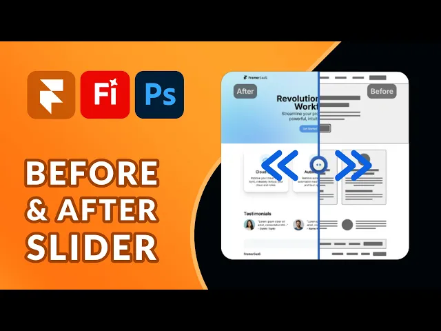
This useful component for Framer is a powerful way to showcase visual transformations directly inside your Framer projects. Whether you’re highlighting photo edits, product improvements, design mockups, or case study results, this interactive slider allows users to drag and compare two images seamlessly. Perfect for portfolios, landing pages, and product showcases, it brings an engaging, hands-on experience to your Framer site.
Built for Framer websites and/or Framer templates, this slider component is fully responsive and easy to customize. You can adjust the slider handle, and styling to match your brand while maintaining smooth performance across devices. It’s an ideal addition to your Framer component library if you want to present visual comparisons in a clean and interactive way.
Component Features
Images
Set the images that will be overlapped within the left/right image control.
Radius
Control the corner radius of the component to fit your style.
Handle
Choose a different image if you wish to style the handle knob.
Divider
Control the width and color of the divider.
Labels
You can choose to show or hide the labels. If you choose to show them you get to customize pretty much everything including font, positioning, padding, radius, color, background, etc.
Background
The background property is primarily for when the images haven't loaded yet and won't be visible once the images come into view.
Video tutorial by Akin Gundogan, make sure to check out his Youtube channel!